
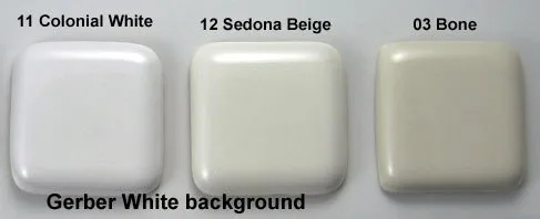
Cotton White is the brighter, cooler choice for modern bathrooms, while Colonial White offers a warmer, creamier tone that suits traditional aesthetics, making the decision between Toto Colonial White Vs Cotton White a matter of matching your existing fixtures to the undertones of your space. Cotton White is the company’s standard “bright white,” while Colonial White sits closer to an off-white or light almond shade.
Comparing Colonial and Cotton White

The primary difference between these colors is how they reflect light and interact with other bathroom finishes.
| Method | How long | Effort | Cost | Best for |
|---|---|---|---|---|
| Cotton White | Instant | Low | Low | Modern, bright rooms |
| Colonial White | Instant | Low | Low | Traditional, warm rooms |
| Bone/Biscuit | Instant | Low | Low | Vintage, cream-toned rooms |
Choosing the wrong white can make a room feel disjointed, especially if you have a stark white tub next to a creamy white toilet. If you’re renovating, pick your largest fixture first and match the others to it. If you have existing fixtures, look at them under both natural and artificial light to see if they lean blue or yellow. Cotton White is the safest bet for most new builds, as it’s the industry standard for contemporary porcelain.
Selecting the bright standard
Cotton White is the most common choice for people who want a clean, crisp look. It works well because it reflects the most light, which helps small or windowless bathrooms feel larger and more open.
- Clean your existing fixtures with a mild, non-abrasive soap.
- Hold a bright white piece of printer paper against your current toilet or tub.
- Observe if the fixture appears grey or yellow compared to the paper.
- If the fixture matches the paper closely, stick with Cotton White for any new additions.
Most homeowners make the mistake of assuming all “white” fixtures are identical. In reality, manufacturers use proprietary pigments that create subtle undertones. If you install a Cotton White toilet next to a fixture with a cream or “biscuit” base, the latter will look dirty or stained by comparison.
The decision rule is simple: if your existing tile or grout has yellow or beige undertones, avoid Cotton White entirely. It will clash, making your expensive new hardware look cheap. Instead, opt for an off-white or almond finish to bridge the gap.
This color is great because it’s easy to find matching accessories, like toilet seats, flush plates, and grab bars. Its weakness is that it can make a room feel clinical or cold if you don’t have warm lighting or textures like wood or tile to balance the space. This isn’t for people who prefer a soft, “spa-like” warmth in their bathroom design.
Choosing the warmer vintage tone
Colonial White is the better choice if your bathroom features warm-toned tiles, wood cabinets, or brass hardware. It provides a softer transition than a bright white, which can sometimes look too stark against earthy colors.
- Evaluate the dominant color of your wall tile or floor.
- Determine if those colors have yellow, tan, or brown undertones.
- Compare the fixture shade to a sample of your wall paint.
- If the paint is off-white or cream, Colonial White will blend in naturally.
The strength of this color lies in its ability to hide dust and water spots better than a stark white finish. It creates a cohesive, high-end look in homes with traditional or transitional decor. The main trade-off is that it’s harder to find matching accessories from other brands, as most generic parts are made in “bright white.” If you buy a Colonial White toilet, ensure your bidet or seat is specifically ordered in the matching color, as a bright white seat on a creamy base is a common mistake that ruins the visual flow.
Coordinating your bathroom design

If you’re looking for a neutral look that’s neither too bright nor too yellow, you might consider Bone or Biscuit shades, though these are becoming less common in modern catalogs.
- Select a neutral focal point in your bathroom, such as the vanity countertop.
- Use a color fan deck to match the undertone of the countertop to your porcelain.
- Purchase samples if you’re unsure, as monitor settings often change how colors appear.
- Finalize your choice by viewing the pieces side-by-side in the room where they will be installed.
This approach ensures that your bathroom doesn’t look like a collection of mismatched parts. The goal is to keep the “temperature” of your whites consistent. If you have a room with poor natural light, avoid the darker off-whites, as they can sometimes look dirty or dingy without enough illumination to show their true color. If you’re working with a professional, always ask to see the color chip in person before placing an order. This is a common mistake people make; they rely on screen photos, which leads to expensive returns. Keep in mind that this varies by model — check the label on the box before you open it, as returns on installed ceramic goods are often rejected by retailers.
Which one should you use?
When you’re in a hurry, choose Cotton White. It’s the default option for most retailers and is almost always in stock, which means you can finish your project without waiting for special order shipping times.
When you’re doing this for the first time, choose Cotton White. Because it’s the industry standard for modern fixtures, it’s much easier to find matching accessories and replacement parts later if something breaks or needs to be swapped out.
When you want the best possible result whatever it takes, look at the undertones of your room. If your space is filled with warm, earthy tones like wood or terracotta, Colonial White will look more intentional and polished. If your space is filled with cool tones like grey, blue, or stainless steel, Cotton White is the superior choice. The trade-off is simple: Cotton White is for convenience and modern brightness, while Colonial White is for design cohesion in warmer, more traditional spaces.
The rules that apply whichever way you choose
Regardless of the color you select, there are three rules that keep a bathroom project on track. First, always verify the rough-in dimensions before buying a toilet, as a color choice can’t fix a toilet that doesn’t fit the plumbing. Local building codes and the Uniform Plumbing Code (UPC) or International Plumbing Code (IPC) provide standards for fixture installation.
Second, check all porcelain pieces for small chips or cracks as soon as they arrive. Once a fixture is bolted to the floor or wall, most manufacturers won’t accept a return for surface damage. Third, use consistent hardware finishes across the room. If you choose Colonial White, look for brushed gold or oil-rubbed bronze faucets, as these complement the warmer tone of the ceramic. If you choose Cotton White, chrome or matte black hardware creates a sharp, modern contrast. Finally, if you aren’t comfortable with plumbing, hire a licensed plumber. Attempting to install a toilet yourself carries a risk of leaking, which can lead to expensive water damage and subfloor rot if the wax seal isn’t seated perfectly.
Frequently asked questions
Is Cotton White the same as standard white?
Yes, Cotton White is the brand’s name for its standard, bright white finish. It’s designed to be a universal match for most white bathroom products, but you should still check the manufacturer’s color code on the packaging. Different brands use different names for their whites, so never assume that one company’s “white” will perfectly match a product from another manufacturer.
Will Colonial White look yellow in my bathroom?
It may appear yellow if your bathroom has very cool, blue-tinted lighting. Colonial White is an off-white with warm undertones, and it’s designed to look soft rather than clinical. If your bathroom has bright daylight bulbs, the warmth will be less noticeable. If you use soft-glow or warm-white bulbs, the yellow undertones will be more prominent, which is exactly what makes the color look intentional.
How long does a porcelain finish last?
The vitreous china finish on a high-quality toilet lasts for decades under normal use. It’s a glass-like coating fired at high temperatures, making it resistant to staining and scratching. You don’t need to worry about the color fading or yellowing over time if you clean it with non-abrasive products. Avoid harsh acid-based cleaners, as these can eventually dull the glaze and make it easier for stains to stick.
Is it safe to mix brands for the toilet and sink?
No, it’s generally not safe to mix brands if you’re trying to achieve a perfect color match. Even if two brands both call their color “white,” the undertones will likely differ enough that they look mismatched when placed next to each other. If you must mix brands, try to keep them in different parts of the room so the slight difference in shade isn’t immediately obvious to the eye.
What happens if I order the wrong color?
You’ll likely face a restocking fee and return shipping costs if the item has already been delivered. Most retailers have strict policies on ceramic goods because they’re fragile and heavy. Before you order, check the retailer’s return policy specifically for toilets and sinks. If you’re unsure, order a color swatch or a small accessory like a matching toilet seat first to confirm the shade.
Can I paint my toilet to match the color?
No, you should never attempt to paint a toilet. The porcelain glaze is a baked-on finish that requires industrial heat to bond correctly. Any paint you apply at home will peel, crack, and harbor bacteria within a very short time. If you don’t like the color of your current fixture, the only way to get a durable, sanitary result is to replace the unit with one that matches your design.
Final Thoughts
To make the right choice, grab a few color samples and hold them against your current vanity or tiles in natural light. You’ll quickly see which shade feels more at home in your space. Don’t rush the process; once you’ve found the perfect match, you’ll be ready to complete your bathroom upgrade with confidence.